Easily Generate React Components from SVG Icons
Use this tutorial if your stack looks like this:
- React
- NextJS, Remix, etc. (it should work with any framework, specifics are sited below)
- NPM/Yarn (this tutorial uses npm)
At some point in your development journey, you're going to want/need to use SVG icons instead of libraries like Lucide Icons in your web apps because maybe you've purchased a giant library of icons and you feel guilty, wasteful and shameful that you aren't using them. Or maybe your project requires some specifically designed icons.
You can use SVG icons in your react web apps as images easily but you will be limited in how you can customize how they appear on the page. This simple 6 step tutorial will help you set up an automated-ish process to convert your svg icons into React components so that you can add them to your pages as components with full styling flexibility.
![]() I purchased these fantastic icons from: https://myicons.co/
I purchased these fantastic icons from: https://myicons.co/
In this tutorial you will:
- Set up an automated-ish process to convert your svg icons into React components
- Use svgo & svgr to generate our icons and an index file which will be used to import the icons into other components.
- Create a svgr template that allows us to define a size prop with default size.
Step 1
Lets start by importing the packages we will be using:
npm install --save-dev @svgr/cli @svgr/plugin-jsx @svgr/plugin-prettier @svgr/plugin-svgoStep 2
Create an svgr.config.js ( .cjs if you are using Remix) file in the root of your project and paste the following code:
    module.exports  = {
	    plugins: ['@svgr/plugin-svgo', '@svgr/plugin-jsx', '@svgr/plugin-prettier'],
	    typescript:  false,
	    template:  require('./svgrTempate.js'),
	    dimensions:  false,
    }
This is the config file that svgr will use in order to process our icons, optimize them (using plugin-svgo), make them pretty (plugin-prettier) and then utilize a template which we will get to next...
Step 3
Create an svgrTemplate.js (.cjs if you are using Remix) file in the root of your project and paste the following code:
 module.exports  =  function  svgrTemplate(
	    { imports, interfaces, componentName, props, jsx, exports },
	    { tpl }
	    ) {
	    return  tpl`
		    ${imports}
		    ${interfaces}
		    const ${componentName} = ({ size = 24, ...props }) => (
		    React.cloneElement(${jsx},
			    {
			    width: size,
			    height: size,
			    ...props
			    }
		    ));
		    ${exports}
	    `;
    };
This essentially uses the svgr props to generate a custom component. The only difference between the default and ours, is that we are adding a {size=24} prop to ours and updating the width and height properties of the svg to set a default. If we were to use the default template that svgr comes with, the icon would take over the entire page.
Step 4
Create an svgo.config.js (.cjs ifyou are using Remix) file in the root of your project and paste the following code:
    module.exports  = {
	    plugins: [
		    {
			    name:  'preset-default',
			    params: {
					overrides: {
						 removeViewBox:  false,
					},
			    },
			},
			{
			    name:  'convertColors',
				params: {
					currentColor:  true
				}
			}
	    ],
    }
Step 5
Open your package.json file and in the "scripts" object paste the following lines:
    "svgo": "npx svgo --config=svgo.config.cjs -f ./icons -o ./icons",
    "icons": "npm run svgo && npx @svgr/cli --out-dir [your apps icon folder] --ext jsx ./[your raw icons folder]",
It should look like this:
    ...
    "scripts": {
	    ...
	    "svgo": "npx svgo --config=svgo.config.cjs -f ./icons -o ./icons",
	    "icons": "npm run svgo && npx @svgr/cli --out-dir [your apps icon folder] --ext jsx ./[your raw icons folder]",
    }
    ...
Important: You have to create two folders, one where you will place the raw icons and the other where you plan on exporting the icons to usign this process. This should be inside your app folder.
I have placed an "icons" folder in the root of my project - so I have replaced the "your raw icons folder" with "./icons".
I have also placed an "icons" folder in my "/app/components/icons" folder and replaced the "your apps icon folder" with "app/components/icons".
Step 6
Now it's time to run your automation and generate our icon components.
- Place some svg icons into your raw icons folder.
- Open the terminal either in your IDE or OS.
cdinto your root project folder.- Run the script by running
npm run icons.
How it works:
- Running this automation will look at your package.json file at the "icons" script and execute the script.
- First it will run the svgo script which converts the colors into currentColor allowing the icons to dynamically change color based on the text color you define either on the component itself or the parent.
- Then it will run svgr to generate the icons using our template
- It will then place them in the output folder that you defined
- Finally, it will generate an index file that you will use to import your icons.
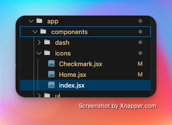
When it's done it should look like this in your folder structure:
 The folder structure after running the script
Using your icon components
Using your icons are easy!
import { IconName } from "@/components/icons";

...
  <IconName size={16} className="text-blue-500"/>
...
Now, every time you add a new icon to your raw icons folder, you will need to run the script again to generate the new icon components.
Watching for new icons
Not Covered here: If you want to be extra fancy, you can set up a watcher to automatically run the script when you add new icons to your raw icons folder. This will allow you to quickly add new icons to your project without having to manually run the script each time.